How to Write a UX Case Study: Complete Structure, Tips and Examples for 2026
Everything a UX designer needs to write a compelling case study in 2026 — the exact structure recruiters follow, what to include at each stage, common mistakes, NDA workarounds, and how to show impact even without real data.
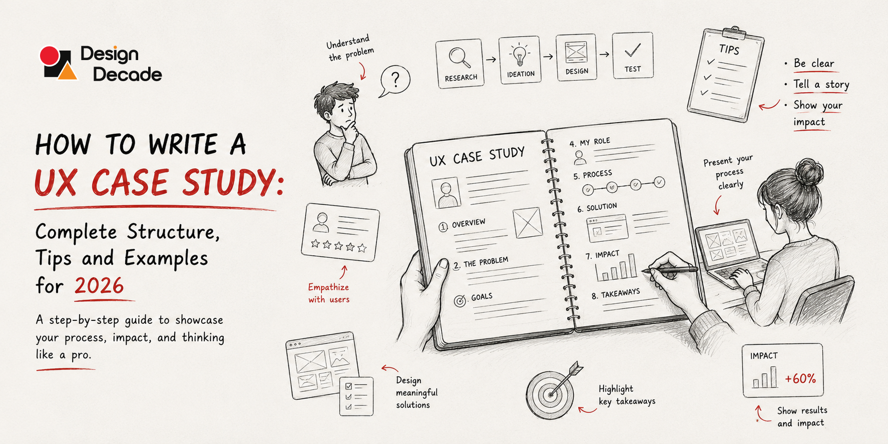
What is a UX case study? A UX case study is a structured narrative that documents your design process for a specific project — explaining the problem you solved, the research you conducted, the decisions you made, and the measurable impact of your solution. Unlike a portfolio gallery that shows finished screens, a case study shows how you think. Recruiters spend 30–60 seconds on an initial portfolio scan and 5–10 minutes on a first case study. The structure that consistently converts those minutes into interviews covers: project overview, problem statement, your role, research and insights, design process, key decisions and rationale, final solution, and outcomes with evidence.
Introduction: Your Portfolio Is 70% of Your Interview
Before a single word is said in a design interview, you have already been evaluated.
A recruiter who gets 200 applications for a junior UX role opens 30 portfolios, looks at 15 seriously, and brings 5 in for an interview. Your portfolio is the first impression — and for most candidates, it is the only one they get.
And yet, the majority of UX portfolios — including many from experienced designers — make the same structural mistakes. They show beautiful final screens with no context. They list tools used instead of decisions made. They describe what they did without explaining why. They present a polished surface over a hollow interior.
The result: a portfolio that looks like design work, but does not feel like design thinking.
Recruiters and design leads do not simply check whether you followed a standard process. They are evaluating how you think. Most reviewers do not read case studies linearly — they scan for signals. Within a few seconds, they try to determine whether your work is relevant to their context and whether your reasoning demonstrates professional maturity.
A UX case study is your chance to make that reasoning visible. Done well, it is the most powerful career document you will ever produce — more important than your CV, more persuasive than your LinkedIn, more distinctive than a cover letter.
This blog gives you everything you need to write one that works: the exact structure, section by section; what to write in each part; what to never include; how to handle NDAs; how to show impact when you have no data; and the most common mistakes that designers at every level keep making.
What Is a UX Case Study, Really?
A UX case study is not a project summary. It is not a slide deck of your deliverables. It is not a gallery of polished mockups with captions.
A UX case study is a linear story that documents your design process. It explains the problem you tried to solve, how you solved it, and the impact of your solution. Unlike a simple gallery of screens, a case study focuses on the logic behind your design decisions.
The key word is logic. A hiring manager does not bring you in for an interview because your screens look attractive. They bring you in because your case study proved you can identify real problems, make principled decisions under constraint, and produce work that changes something measurable.
Hiring managers do not hire pretty screens — they hire judgment. A UX portfolio is not a gallery; it is an argument that you can think. The unit of that argument is the case study.
How Many Case Studies Do You Need?
If you are a junior UX designer, you should include 2–3 case studies in your portfolio. If you are a mid-level or senior UX designer, include 4–5 of your most impressive projects. Quality over quantity — always.
Recruiters read the first case study for 5–10 minutes, the second for 3–5, and the third for 1–2. If you post 8 mediocre case studies, the recruiter sees the first 3 mediocre ones and stops. Always put your strongest case study first.
How Long Should a Case Study Be?
Aim for clarity and depth rather than unnecessary length. For many projects, 800–1,500 well-structured words combined with relevant visuals — sketches, wireframes, prototypes, screenshots — are absolutely enough.
Length is not depth. A 4,000-word case study that repeats itself and buries insights in narrative is weaker than an 800-word case study that makes every sentence count.
The Complete UX Case Study Structure (Section by Section)
This is the structure that consistently performs with recruiters and hiring managers in 2026. Each section has a specific job to do. Skip one, and the whole story weakens.
Section 1: The Title and Project Summary (The Hook)
What it does: Earns the reader’s attention in the first ten seconds and sets up everything that follows.
What to include:
A specific, outcome-oriented title — not “Redesigning an App” but “Redesigning the Onboarding Flow for a Fintech App to Reduce 7-Day Churn by 31%.” The outcome is in the headline. The reader knows immediately whether this is relevant to them.
Beneath the title, include a project summary of 2–3 sentences: who the client or product was (or a description if under NDA), what the core problem was, and what the result was. This is the part 70% of readers will read before deciding whether to keep going.
Then include a quick metadata block:
- My role: What you specifically owned (not “worked on” — owned)
- Team: Who else was involved (this signals collaboration)
- Timeline: Duration of the project
- Tools: What you used (brief — this is not your CV)
- Platform: Mobile, web, desktop, or other
What not to do: Do not use vague titles like “Project X: UX Redesign.” Do not bury your role in the fourth paragraph. It must be immediately clear what you were responsible for — vagueness reads as inflation.
Section 2: The Problem Statement (The Why)
What it does: Establishes the real problem — for users and for the business — and demonstrates that you can frame a design challenge with precision.
What to include:
Start with the user problem. Who were the users? What was their pain? What were they failing to do, feel, or achieve? Make this specific and human — not “users had difficulty navigating” but “first-time users abandoned the onboarding flow at step 3 because they were asked for payment information before they had seen any product value.”
Then establish the business problem. Why did this matter to the organisation? Lost revenue? High support volume? Poor retention? The best problem statements show the connection between user frustration and business cost — because that is the connection your future employer needs you to make every day.
Include the constraints. A strong case study introduction highlights project limitations, setting expectations early and preventing misinterpretation later. Time constraints, technical limitations, budget, team structure — these are not excuses. They are the context that makes your design decisions legible.
Key questions to answer in this section:
- Who was affected, and how?
- What was the measurable cost of this problem (if known)?
- What had been tried before, and why had it not worked?
- What were the constraints on the solution?
Section 3: Your Role and Responsibilities (The Credibility Anchor)
What it does: Tells the reader exactly what you contributed — preventing either underrepresentation or overclaiming.
What to include:
Be precise. “I led the research and prototyping phases, collaborated with the engineering team on feasibility reviews, and presented final designs to the product leadership team” is far stronger than “I was a UX designer on this project.”
If this was a team project, name your collaborators and their roles. Credit designers by name throughout — this signals professional maturity and honesty about collaborative work.
Be honest about the limits of your contribution. Claiming sole ownership of a project designed by a five-person team is a trust-destroying mistake that interviewers catch immediately.
Section 4: Research and Discovery (The Evidence)
What it does: Shows that your design was grounded in real user understanding, not assumptions.
What to include:
This is the section most junior designers skip — and the section most hiring managers use to separate strong candidates from weak ones.
Document your research approach: what methods you used, why you chose them, how many users you spoke to, what data sources you drew from. Include the artifacts: interview guides, affinity maps, survey summaries, competitive analysis, heuristic evaluation findings.
Crucially, show the synthesis — not just what you found, but what it meant. Raw data is not insight. “Users said they found the interface confusing” is data. “Users were abandoning the checkout because they perceived three unrelated steps as three separate purchases” is insight.
Recruiters look for clear problem statements, evidence of user research, your unique design process, collaboration with developers and stakeholders, and real business outcomes.
Visuals that belong here:
- User interview key quotes (anonymised)
- Affinity diagram photograph or screenshot
- Persona or user archetype (brief — one per primary user type)
- Journey map highlighting the key pain points
- Competitive analysis summary table
Section 5: Defining the Design Brief (The Pivot)
What it does: Shows that you can translate research insight into a focused, actionable design direction — one of the hardest and most valuable skills in UX.
What to include:
After your research, you should have a reframed understanding of the problem. This is where you articulate it. “How might we…” statements work well here. So does a clear design brief: what you are designing, for whom, to achieve what specific outcome, within what constraints.
This section is short — a paragraph or two — but it is the hinge between discovery and execution. Without it, your case study reads like a list of activities. With it, it reads like a designer who can think.
Section 6: Design Process and Iterations (The Thinking)
What it does: This is the section that most differentiates strong case studies from weak ones. It shows not just what you designed, but how you got there.
What to include:
Show your early work — and do not be embarrassed by it. Rough sketches, low-fidelity wireframes, and first-round concepts that did not make it to the final design are evidence of thinking. They show that you explored options rather than reaching for the first idea that came to mind.
Document your iterations. What did you try? What did you test? What did you learn from testing that changed the direction? There might have been moments when the whole thing went off-rails, or when you needed to go back to the drawing board to iterate. Those are all part of your design story.
Be specific about design decisions. Not “I chose a card layout” but “I chose a card layout after usability testing revealed that users were scanning for the property name rather than reading descriptions — the card format put the name at the top-left, where eye-tracking data shows primary scan fixation.”
The structure of this section follows a narrative arc:
The journey unfolds — explain your design process. A major challenge appears — highlight the hardest or most unexpected problem. The confrontation — describe how you tackled the challenge and adjusted your approach. The resolution — show the results and the impact of your work. This structure helps recruiters follow your reasoning without cognitive effort.
Visuals that belong here:
- Sketches or whiteboard photos
- Low-fidelity wireframes with annotations
- Information architecture diagrams or user flows
- Side-by-side comparison of iteration A vs iteration B
- Usability testing session screenshot or participant quote
Section 7: Key Design Decisions (The Rationale)
What it does: Makes your judgment visible. This is what separates designers who execute from designers who lead.
What to include:
Pick two to four of the most significant design decisions in the project. For each one, explain:
- The options you considered — what were the realistic alternatives?
- The criteria you used to evaluate them — user need, technical constraint, business goal?
- The decision you made and why — not “we chose this because it looked better” but because of a specific user insight, technical constraint, or strategic priority.
- How you validated it — what told you the decision was right?
This section can be structured as mini case-studies within the case study. Each decision is a lens into how you think under constraint.
Section 8: The Final Solution (The Deliverable)
What it does: Shows what you built. But in the context of everything that precedes it, the final screens are not the destination — they are the evidence of a journey.
What to include:
Show the final designs clearly and cleanly. Annotate key interactions. If you have a prototype, embed it or link to it. If interaction design is central to your work, embed prototypes or videos directly in your case studies. Static images cannot capture the nuances of motion and timing.
For each screen or flow you show, add a brief annotation explaining what design decision it represents and why it matters for the user. Do not let screens speak for themselves — speak for them.
What not to do: Do not dump every screen in the project. Select the four to eight screens that best represent the most important design decisions and tell the story most clearly.
Section 9: Outcomes and Impact (The Proof)
What it does: Closes the loop between the problem you identified and the value you delivered. This is the section that converts case study readers into interview invitations.
What to include:
The strongest portfolios close case studies with numbers: “task completion went from 62% to 87%”, “average time-on-task dropped from 2:40 to 0:55”, “support tickets on this flow went down 40%”. Numbers are a basic expectation for mid and senior roles at top-tier companies.
But not every project has clean metrics — and that is fine if you handle it honestly. You can still describe qualitative outcomes: user feedback, stakeholder approval, fewer support issues, or what changed after launch. Even small evidence builds trust in your case study.
Types of impact to document:
- Quantitative: conversion rates, task completion, time-on-task, NPS, support ticket volume, retention
- Qualitative: user testing feedback, stakeholder response, team adoption of design system components
- Process: what the project changed about how the team works, what decision frameworks it established
Avoid vague claims like “users responded positively” — specificity is what makes impact credible.
Section 10: Reflection and Learning (The Maturity Signal)
What it does: Demonstrates professional self-awareness — one of the clearest signals of seniority and growth mindset that hiring managers look for.
What to include:
Include reflection: one thing you would do differently. Senior designers notice this section more than juniors expect.
Answer honestly:
- What would you do differently with more time or resources?
- What did you learn from this project that changed how you approach design?
- What did not work as expected — and what would you change?
This section is deliberately short — two to three sentences or a short paragraph. But its presence signals something that no amount of polished screens can communicate: intellectual honesty and the capacity to grow.
What Recruiters Are Actually Looking For
Understanding the structure is necessary. Understanding the recruiter’s mindset is what takes your case study from good to unforgettable.
Recruiters and design leads scan UX case studies for signals, not linear narratives. Key signals include: does this project resemble the type of work their team does — not necessarily in the same industry, but in similar problem complexity, constraints, or collaboration patterns.
Recruiters typically spend three to five minutes skimming a portfolio. Your job is to make those minutes count. Every extra sentence competes for attention. Keep only what helps the reader understand your role, thinking, and impact.
The five signals recruiters scan for:
1. Role clarity. Within the first thirty seconds, can the recruiter answer: “What exactly did this person do?” If not, they move on.
2. Problem quality. Did you choose a genuinely interesting, complex, or relevant problem to solve? Solving a trivial problem elegantly is less impressive than solving a hard problem imperfectly and honestly.
3. Process rigour. Is there evidence that design decisions were informed by user research rather than personal taste?
4. Decision quality. Were the design decisions made for clear, articulable reasons — not just because it “felt right” or “looked better”?
5. Impact evidence. Did the work change something? Numbers are best. Honest qualitative outcomes are second. Vague claims of “positive feedback” are red flags.
Handling NDAs, Confidential Work, and Student Projects
When Your Best Work Is Under NDA
This is one of the most common challenges designers face, and it has practical solutions.
If your work is under NDA, focus on process and impact rather than final deliverables. You can anonymise specifics while still telling a compelling story.
Practical approaches:
- Abstract the brand and product: “A major fintech platform serving 5 million users” instead of naming the company
- Show process artifacts rather than final designs: wireframes, user flows, research synthesis documents, decision frameworks are rarely covered by NDA
- Show before/after impact without brand attribution: conversion rates, task completion improvements, qualitative outcomes
- Get written permission for specific assets: many companies will approve showing certain non-proprietary screens if asked directly
Even without full visuals, you can show wireframes, user flows, assumptions you tested, and what you learned from the project without breaking confidentiality.
When You Are a Junior Designer Without Real Client Work
Junior designers can include speculative or school projects in their portfolio case studies if you treat them seriously: define a clear problem, document your process, justify your decisions, and reflect on what you learned. Recruiters and employers value the thinking process and reflection even more than polished UI when assessing junior UX portfolios.
Strong project types for junior portfolios:
- Redesign concepts of real products with clear problem framing (redesigning the Zomato onboarding, redesigning IRCTC booking)
- Design challenges from platforms like Daily UI, UX challenges, or open-source design briefs
- Community or nonprofit projects — real users, real constraints, even without commercial stakes
- Bootcamp or course projects — treated with full rigour, documented like client work
The bar is not “real” vs “fake” work. The bar is rigorous thinking vs superficial execution.
When You Have No Quantitative Impact Data
Instead of data, you can show annotated before/after screenshots, discuss usability test results (even informal ones), share user feedback or illustrative scenarios, and explain how design changes addressed key pain points or improved usability.
Even if you ran only three informal usability sessions, document the specific issues they surfaced and how your design addressed them. Three real user sessions documented honestly are more credible than invented metrics.
The Most Common UX Case Study Mistakes
These are the errors that appear consistently in portfolios across junior, mid, and senior levels. Each one is fixable once you know it exists.
Mistake 1: Showing Process Without Insight
The most common structural error. Listing every step of the design process — “I did a competitive analysis, then I made wireframes, then I tested them” — without explaining what you learned at each step or how it changed your direction. Process without insight is a timeline, not a case study.
Fix: For every research activity and design decision, add one sentence explaining what it revealed and how that changed your approach.
Mistake 2: Burying Your Role
Many designers describe a project as if they designed it alone, then mention “I worked with a team of five” in a footnote. Or they mention their role so vaguely that a recruiter cannot tell if they ran the project or attended the meetings.
Fix: Name your exact contribution in the project summary. “I led user research and designed the checkout flow. The lead designer owned the overall visual system.”
Mistake 3: The Endless Scroll of Final Screens
Showing every screen in the product because you worked hard on all of them. The result is a wall of mockups with no guidance on what matters or why.
Fix: Select four to eight screens that best represent your most important decisions. Annotate each one. Tell the story with a curated edit, not an exhaustive archive.
Mistake 4: Describing What You Did Instead of Why
“I used card sorting to organise the navigation” is a method description. “I used card sorting because initial usability testing showed users were using mental models that didn’t match our existing navigation — the card sort revealed three distinct user taxonomies we hadn’t anticipated” is a design rationale.
Fix: For every process step and every design decision, add “because” or “which showed us that.” The reasoning is the value.
Mistake 5: Generic Impact Claims
“Users responded positively.” “Stakeholders were satisfied.” “The product performed well after launch.” These are placeholders masquerading as outcomes. They communicate nothing credible.
Fix: Be specific. “In usability testing, task completion on the new onboarding flow improved from 54% to 78%.” “After launch, the support team reported a 40% reduction in tickets related to this flow.” If you have no metrics, say what you observed and why you believe the design improved the experience.
Mistake 6: No Reflection Section
Designers who present their work as if every decision was obvious and every outcome was perfect read as either inexperienced or dishonest. Design is hard. Projects have constraints. Some decisions were compromises.
Fix: Add two to three sentences at the end of every case study answering: “What would I do differently?” This single addition signals seniority more reliably than any visual.
Mistake 7: Walls of Text With No Visual Support
A case study that describes a wireframe instead of showing it, or explains a user flow without a diagram, is failing at the most basic level of UX design — using the right medium to communicate an idea.
Fix: For every concept you describe, ask: would a visual show this faster and more clearly than text? If yes, add the visual. Research synthesis belongs in an affinity map. Design evolution belongs in a side-by-side comparison. Outcomes belong in a highlighted metrics block.
Visuals, Format, and Presentation
The Role of Visuals
In UX portfolios, visuals are not decoration. Design leads do not just scan visuals — they read selectively, looking for clarity, structure, and intent.
Every visual in your case study should do one of three things: show a design artifact (wireframe, final screen, prototype), show your research process (affinity map, journey map, test session), or show impact (before/after, metric chart, usability comparison).
Visuals that do none of these — decorative headers, stock photography, colour palettes for their own sake — dilute the case study.
How to Present Visuals Effectively
- Annotate everything: A wireframe without annotation is a picture. A wireframe with annotations explaining the design decisions it embodies is evidence of thinking.
- Show before and after: Comparison is the fastest way to demonstrate improvement. A before/after pair of screens communicates value that a page of text cannot match.
- Embed prototypes: Where possible, link to or embed a clickable prototype. Interaction design is experienced, not described.
- Use consistent device mockups: Inconsistent presentation — some screens in browser frames, some floating, some on phone mockups, some on white backgrounds — creates visual noise that undermines credibility.
Format: Website vs PDF
Recruiters want a quick overview (your homepage) and the ability to dive deep into 2–3 case studies. A one-page portfolio cannot do both well. Use the homepage as a summary with links to detailed case study pages.
In 2026, a case study published on your portfolio website outperforms a PDF in almost every hiring scenario. It is faster to navigate, easier to update, better for embedding prototypes, and more professional. Save the PDF version for applications that explicitly require one — use the same content, optimised for a scrollable document format.
Best platforms for UX case studies in 2026:
- Framer / Webflow — maximum design control, ideal for senior designers who want the portfolio itself to be a work sample
- UXfolio — purpose-built for UX case studies, recruiter-optimised templates, fastest path to a professional result
- Notion — surprisingly effective for mid-level designers, clean and easy to update
- SitesPlaced — AI-assisted first draft from your resume, good for getting something live quickly
The Complete UX Case Study Checklist
Before you publish any case study, run through this checklist. Every item should be a confident yes.
Project Overview ☐ The title communicates the project and outcome, not just the type of work ☐ The 2–3 sentence summary covers: product/client, problem, and result ☐ My specific role is named clearly in the first section ☐ Team members and their roles are credited
Problem Statement ☐ The user problem is specific and human ☐ The business problem and its cost are documented ☐ Project constraints and timeline are stated ☐ A clear design question or “how might we” frames the challenge
Research ☐ Research methods are named with justification for why each was chosen ☐ At least one research artifact is shown (affinity map, interview notes, survey data) ☐ Insights are distinguished from raw observations ☐ User personas or archetypes are based on research, not assumptions
Design Process ☐ Early-stage work (sketches, low-fi wireframes) is shown — not just final polish ☐ At least one iteration is documented with what changed and why ☐ Two to four key design decisions are explained with rationale ☐ The narrative follows: problem → exploration → insight → decision
Final Solution ☐ Final screens are shown clearly with device context ☐ Each key screen is annotated or accompanied by explanatory text ☐ A prototype link or embed is included where possible ☐ The solution is visibly connected to the research insights
Outcomes ☐ Impact is documented with specific evidence (quantitative or qualitative) ☐ Vague claims like “users responded positively” are replaced with specifics ☐ If no data is available, honest qualitative evidence is provided
Reflection ☐ At least one honest “what I would do differently” statement is included ☐ A key learning from the project is articulated
Presentation ☐ All visuals are annotated or have explanatory context ☐ Before/after comparison is shown where applicable ☐ The case study is scannable: headings guide the reader through without reading every word ☐ The reading time is appropriate — clear and deep, not padded
Frequently Asked Questions
What is the ideal structure for a UX case study?
The structure that performs consistently with recruiters in 2026 covers ten sections: project title and summary, problem statement, your role and responsibilities, research and discovery, the design brief, design process and iterations, key design decisions with rationale, the final solution, outcomes and impact, and a reflection section. Each section does a specific job — the goal is to make your thinking visible and your impact credible.
How long should a UX case study be?
Aim for 800–1,500 words with strong visual support. Clarity and depth matter more than length. A 4,000-word case study that repeats itself is weaker than an 800-word case study that makes every sentence count. If your case study takes more than 12 minutes to read, edit it down.
What should a junior UX designer include in a case study if they have no real client work?
Speculative redesigns of real products, bootcamp projects, nonprofit or community projects, and design challenge responses are all valid. Treat them with the same rigour you would apply to client work: define a clear problem, document your process, justify your decisions, and reflect on what you learned. Recruiters evaluate the thinking process and self-reflection, not whether the client paid for the work.
How do I write a UX case study when my work is under NDA?
Focus on process and impact rather than final deliverables. Anonymise the brand and product name. Show process artifacts — wireframes, user flows, research synthesis — which are rarely covered by NDA. Document impact without brand attribution. Where possible, get written permission from the company to show specific non-proprietary elements.
What is the difference between a UX portfolio and a UX case study?
A UX portfolio is the collection of all your case studies and the website that presents them. A UX case study is a single, in-depth narrative documenting one project — the problem, process, decisions, and outcomes. The portfolio is the container. The case study is the substance. Strong portfolios are built from strong case studies; strong case studies are built from rigorous design thinking and honest documentation.
How do I show impact in a case study if I don't have access to analytics data?
Show qualitative evidence: usability testing completion rates (even from three informal sessions), specific user quotes from testing, stakeholder feedback, reduction in user-reported confusion, or before/after comparison of the specific user tasks the design was meant to improve. Small, honest, specific evidence is far more credible than invented metrics.
How many case studies should I have in my portfolio?
Two to three for junior designers, four to five for mid-level and senior designers. Quality over quantity — always. A portfolio of two deeply documented, rigorously argued case studies will consistently outperform a portfolio of eight shallow project thumbnails.
What is the most important section of a UX case study?
The problem statement and the key design decisions section together. The problem statement proves you can identify and frame real challenges. The key decisions section proves you can think under constraint and make principled choices. These two sections are where most hiring managers decide whether to keep reading or close the tab.
Conclusion: Your Case Study Is Your Design Work
There is a subtle irony in how UX designers approach their own case studies.
They spend weeks obsessing over the information architecture of the products they design for others — making every decision deliberate, every user journey intentional, every piece of content earn its place on the page.
Then they write a case study by listing what they did, uploading their final screens, and calling it a portfolio.
The case study deserves the same thinking you give your best work. It has a user (the recruiter or hiring manager). It has a goal (to communicate your thinking and earn an interview). It has a problem to solve (turning invisible design decisions into visible, compelling evidence of your judgment). And it has a conversion point — a moment where the reader decides whether to contact you.
Your introduction is the only part of your case study where you still have your reader’s full attention. You can either capture it for the rest of the case study or lose it.
Design the case study with the same intent you bring to your best product work. Define the problem (what does the recruiter need to know?). Research the user (what do hiring managers at your target companies care about most?). Remove everything that does not serve the goal. And end with evidence that the work changed something.
That is not just good portfolio strategy.
That is good UX design.