
Multimodal UX Design: How to Design for Voice, Touch, and Gesture Simultaneously
What is multimodal UX design? Learn how to design experiences that seamlessly combine voice, touch, gesture, haptics, and spatial interaction with 8 core principles, real examples, and a practical framework for 2026
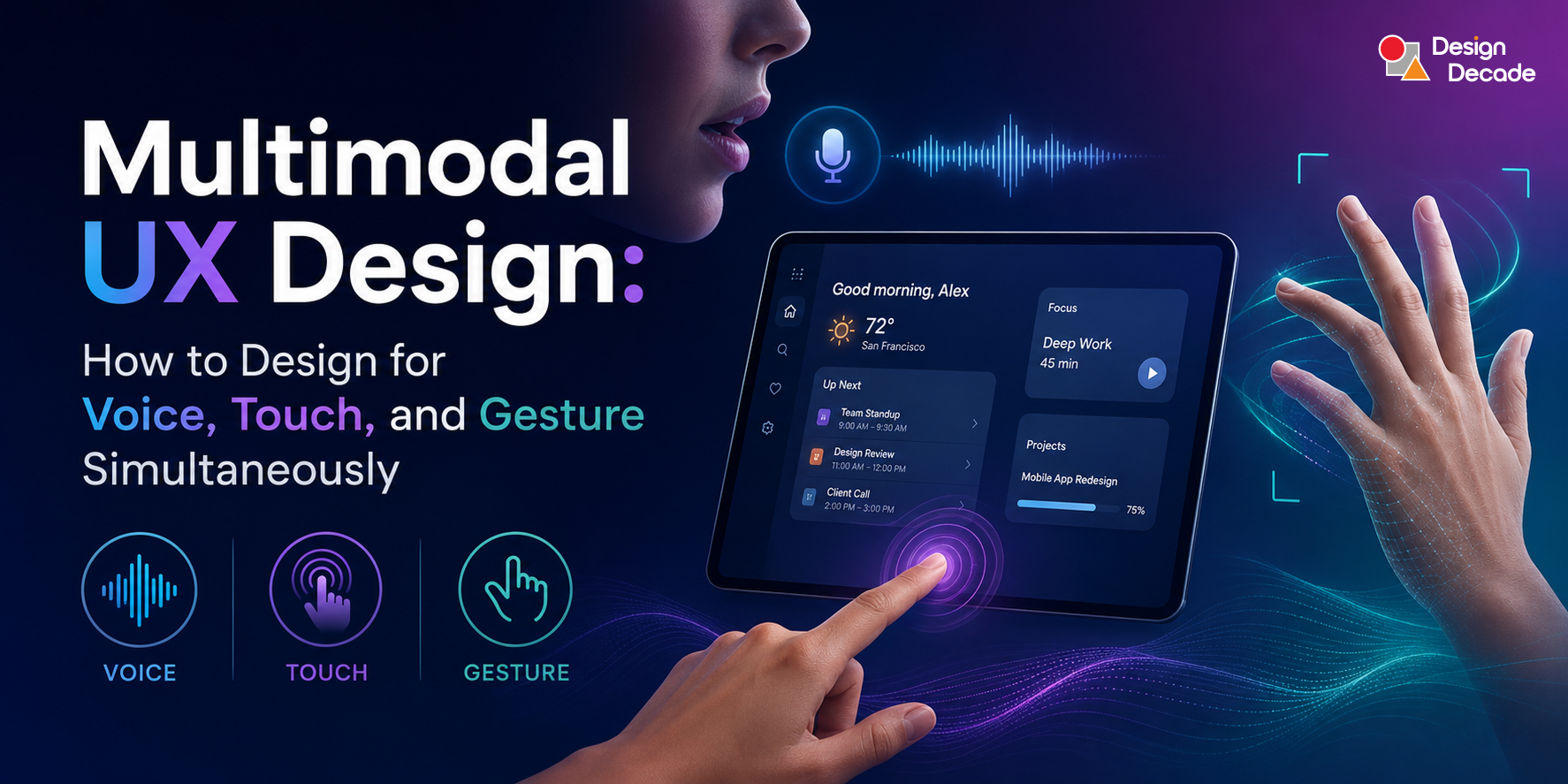
What is Multimodal UX Design? Multimodal UX design is the practice of creating interfaces that accept and respond to multiple input modes simultaneously — voice, touch, gesture, gaze, haptics, and spatial interaction — allowing users to interact in whatever way is most natural for their current context. Unlike single-mode interfaces that force users into one interaction channel, multimodal UX lets users switch fluidly between modes or combine them in a single action. The core design challenge is ensuring all modes stay synchronised, provide consistent feedback, and complement rather than duplicate each other — so the experience feels seamless whether a user speaks, taps, swipes, or gestures.
Introduction: The Interface Has Grown Beyond the Screen
For twenty-five years, UX designers worked on a single, shared assumption: the user is sitting in front of a screen, touching it or clicking it.
That assumption made everything tractable. You designed for a fixed viewport. You designed for deliberate, sequential input. You tested on a device, shipped to a device, measured engagement on that device.
That assumption is no longer true — and in 2026, the gap between that assumption and reality is widening fast.
A surgeon wearing an AR headset needs to interact with patient data while keeping both hands sterile. A driver needs to change navigation settings without taking eyes off the road. A warehouse worker needs to log inventory while carrying a package. A child learning to read uses voice, touch, and camera simultaneously in an adaptive reading app.
None of these experiences fit a single-screen, single-input paradigm. All of them need multimodal UX.
Multimodal design — combining voice, touch, and visual feedback in a single interaction model — has crossed the threshold from experimental to expected in 2026. Multimodal interfaces combine several inputs such as voice, text, images, gestures, and touch, allowing users to interact however feels most natural to them in that moment.
This blog is your complete, practical guide to multimodal UX design: what it is, how each modality works, how to combine them without creating chaos, eight core design principles, real-world examples across industries, and the skills you need to design these experiences well.
What Is Multimodal UX? A Precise Definition
The Definition
Multimodal UX design refers to creating interfaces that accept and respond to multiple input and output modes simultaneously — like voice, touch, and vision — allowing users to interact naturally and fluidly.
The key word is simultaneously. Multimodal UX is not about supporting voice on one screen and touch on another, or offering a separate “voice mode” users switch into. It is about designing a system where all input channels are live, coherent, and complementary — and where the system intelligently resolves the user’s intent regardless of which channel they use or combine.
Input Modes vs Output Modes
Multimodal UX has two sides, and both require design attention.
Input modalities are the ways users communicate with the system:
- Voice — spoken commands, queries, dictation
- Touch — tap, swipe, pinch, hold, multi-finger gestures
- Gesture — body movement, hand tracking, pointing in space
- Gaze — eye tracking, attention direction
- Text — keyboard, handwriting, annotation
- Physical presence — proximity sensors, body posture, motion
Output modalities are the ways the system communicates back:
- Visual — screen content, animations, spatial overlays, indicator lights
- Audio — voice responses, sound effects, earcon feedback
- Haptic — vibration patterns, texture simulation, force feedback
- Spatial — 3D placement of information in physical space
The key insight is that modes should complement each other, not just duplicate the same functionality across channels. Good multimodal design lets users choose the most natural input for their current context: voice when hands are busy, touch when in a quiet office, gesture when wearing gloves.
The Core Distinction: Complementary vs Redundant Multimodal Design
There are two fundamentally different approaches to multimodal design, and only one produces genuinely great experiences.
Redundant multimodal design offers the same functionality through multiple channels. You can either speak a command or tap a button — but they do the same thing. This is safer and easier to build, but it misses the real potential of multimodal interaction.
Complementary multimodal design lets different modalities contribute different information to a single intent. The real power of multimodal UX is mode combination — using voice and touch together, or gaze and gesture together. Classic example: “Put that (point at object) there (point at location).” The voice provides the verb. The gesture provides the noun.
This is a richer and more cognitively natural way to interact — because it mirrors how humans actually communicate. We point and talk. We look and gesture. We never use only one communication channel at once in real life. The best multimodal UX lets the interface meet us where we naturally are.
The State of Multimodal in 2026: Why This Is Now Critical
Context
Data Point
Multimodal design
Has crossed from experimental to expected in 2026 for SaaS and consumer products
Voice in cars
Mercedes, Toyota, and virtually all major automotive brands now ship voice-hub dashboards
Spatial computing
Apple visionOS 26 / 27 enables eye tracking, hand gesture, and voice simultaneously — now targeting enterprise
AR adoption
100M+ shoppers used AR shopping experiences in 2020; enterprise XR market growing 24% annually
Accessibility
1.3 billion people globally live with some form of disability — multimodal design is their lifeline
Spatial job roles
AR/VR design roles have increased 154% over the past five years
3D elements
3D interactive elements on websites can multiply user engagement sixfold
The Catalysts Driving Multimodal Adoption in 2026
Spatial computing at scale. Apple Vision Pro with visionOS 26 enables users to securely save their eye and hand data, vision prescription, and accessibility settings, and companies worldwide are harnessing spatial computing to supercharge workflows in design, training, sales, education, and more. At WWDC 2026, Apple shifted spatial computing from a consumer novelty toward enterprise infrastructure — with Foveated Streaming, Spatial Preview, and an on-device intelligence layer that reads the physical environment to surface relevant context on demand.
AI that understands multi-channel intent. OpenAI’s latest multimodal models can interpret tone and images simultaneously, while companies like Hume AI are building voice interfaces capable of expressing and responding to nuanced emotional states. The AI layer is catching up with the interface layer.
Contextual computing everywhere. Smart homes, automotive dashboards, wearables, AR overlays in warehouses and hospitals — these are not edge cases. They are mainstream deployment environments in 2026, and every one of them requires thoughtful multimodal design.
Accessibility as standard. Multimodal interfaces include everyone by offering different ways to interact — people can use voice, gestures, or visuals, so no one is left out. Designing for multiple input modes is increasingly recognised as the foundation of genuinely accessible design, not just a feature layer.
Designing Each Modality Well
Before designing how modes interact, you need to understand the distinct design challenges and constraints of each one. Here is what designers need to know about voice, touch, gesture, haptics, and gaze.
Voice: The Most Powerful and Most Brittle Modality
Voice is the most natural human communication channel — we have been using it for two hundred thousand years. But it is also the most context-dependent and failure-prone.
Voice interfaces are mature enough to be practical but still limited enough to require careful design. The most common pattern in 2026 is voice as a complement to screen, not a replacement.
Core voice design principles:
Confirm before acting. Voice commands should echo back the interpretation before executing — “Setting timer for 15 minutes. Is that right?” This single pattern prevents the majority of voice interaction failures.
Always offer escape hatches. Always provide a screen-based alternative for every voice interaction. Users in noisy environments, users with speech differences, users who simply prefer touch — all need a graceful exit from voice.
Keep responses short. Voice answers over 15 seconds lose attention. Design audio responses like you design error messages: as short as possible, as clear as necessary.
Handle errors gracefully. “I didn’t understand that. You can say X or Y” is far better than silence. Error states in voice design are experienced as broken conversations, not broken screens. Design them as conversation recovery, not system failure.
Design for the environment. Voice input fails in noisy environments, in public spaces where speaking feels socially uncomfortable, and in shared workspaces where other voices create recognition conflicts. Design your voice features with a clear understanding of where users will actually use them — not where they ideally would.
Touch: The Most Trusted Modality
Touch is the interaction paradigm users have the most deeply internalised. Tap targets, swipe patterns, pinch-to-zoom, pull-to-refresh — these have been in users’ muscle memory for fifteen years. Touch is fast, reliable, and precise on flat surfaces.
The challenge for touch in multimodal systems is not the interaction itself — it is the integration. Touch needs to coexist gracefully with voice and gesture without creating accidental activations, mode conflicts, or unexpected takeovers.
Core touch design principles in multimodal systems:
Touch is the anchor modality. When in doubt, everything should be achievable through touch alone. Voice and gesture supplement; touch is the safety net.
Design touch targets for context. In an XR environment where users are gesturing at a distance, touch target sizes need to scale accordingly. In XR environments, users point, grab, and pinch. These gestures feel natural but lack the precision of touch. Design larger hit targets, add visual hover states at a distance, and provide snap-to-grid alignment for layout tasks.
Do not break touch when voice is active. A common failure in early multimodal products was disabling touch while the system listened for voice input. Never force users out of one modality to access another.
Gesture: The Most Discoverable Design Challenge
Gesture interaction is where multimodal UX gets genuinely hard. Touch gestures on phones — swipe, pinch, tap — are now deeply learned patterns. But in spatial computing, AR, and gesture-controlled environments, the design challenge is fundamentally different.
The biggest challenge in gesture-based UX is twofold. The easy part is gesture recognition. The harder part is discoverability — users need to know which gestures exist, when to use them, and how the system perceives them. This requires very intuitive design and a deep understanding of ergonomics and cultural nuance. What feels natural in one region may feel awkward or even offensive in another.
Core gesture design principles:
Simplicity over spectacle. A gesture should feel instinctive, not performative. The moment a user has to remember a specific gesture sequence, you have lost the naturalness that makes gesture valuable.
Design for fatigue. Avoid repetitive or strenuous motion. “Gorilla arm” — the fatigue caused by holding arms extended for extended gesture interaction — is a real physical constraint. Gestures for frequent actions must be small, close to the body, and low-effort.
Teach gestures progressively. Unlike buttons (which are visible and labeled), gesture interfaces range from phone swipe patterns to spatial computing hand tracking. The design challenge is discoverability: unlike buttons, gestures are invisible until learned. Use progressive onboarding, visual prompts at the right moment, and contextual hints to surface gesture affordances without overwhelming the interface.
Combine with other modes for precision. Cross-modal integration — combine gestures with gaze or voice for clarity. For example, looking at an object and saying “select this” removes the ambiguity that pure gesture leaves.
Validate with haptics or visuals. Haptic or visual cues validate successful gestures. Without confirmation that the gesture was received, users repeat it — often faster and more forcefully, creating second activations.
Haptics: The Modality Designers Underuse Most
Haptic feedback is the silent layer of multimodal design — underused, underappreciated, and extraordinarily powerful when done well. It is the only output modality that communicates without requiring visual attention or adding audio to the environment.
Haptics can signal yes/no or urgency levels. A subtle single pulse for “action confirmed.” A sharp double pulse for “error.” A slow, growing rumble for “warning.” These distinctions can be designed with the same precision as visual feedback — and they communicate even when the screen is out of view and the environment is too loud for audio.
Core haptic design principles:
Design haptic patterns as a semantic language. Each haptic pattern should mean something consistent, the way a red icon always means stop. Build a haptic vocabulary and apply it systematically.
Use haptics to reduce visual cognitive load. In automotive, medical, and spatial computing contexts, keeping the user’s eyes free is not just convenience — it is safety. Haptic feedback is how you confirm an action without requiring a glance.
Match haptic intensity to action significance. A light tap for informational feedback. A strong pulse for a critical alert. Haptic intensity is a hierarchy signal, just like visual colour and size.
Gaze: The Emerging Modality
Eye tracking in spatial computing interfaces — Apple Vision Pro’s core interaction model — is becoming a mainstream design concern for teams working on enterprise and immersive applications.
The core interface paradigm of Apple Vision Pro — look at what you want and tap fingers together to select — is intuitive. Most users acclimate within minutes. In well-lit environments, eye tracking is accurate enough that small UI targets remain usable without a pointer.
The UX principle here is that gaze reveals intent before action. A user who looks at a button is signalling interest. Designing interfaces that respond subtly to gaze — a slight highlight, a label appearing — creates a sense of intelligence and responsiveness that flat interfaces cannot replicate.
Eight Core Principles of Multimodal UX Design
These are the principles that the best multimodal products in 2026 are built on. Apply all eight.
Principle 1: Context Determines the Dominant Mode
No single modality is universally best. Multimodal UX is about building context-aware products that support multiple human-centred communication modes — it focuses on designing the right interaction for the context by progressively disclosing necessary UI elements.
Design each modality as the dominant channel in its natural context:
- Voice is dominant when hands are occupied and eyes are engaged elsewhere
- Touch is dominant in quiet, focused, precision-required contexts
- Gesture is dominant in spatial, hands-free, or gloved environments
- Haptics are dominant when visual and audio channels are saturated
In a smart environment for workers such as a warehouse, an adaptive UI would switch to only vocal mode when the worker is handling fragile objects, to avoid distracting with visual or gesture UI. When the environment becomes noisy, the system may fall back from voice to visual-only feedback to maintain usability.
Principle 2: Never Force Mode Switching
The moment you require a user to choose a mode before they can act, you have broken the multimodal experience. A well-designed voice and touch interface never forces the user to choose. It accepts both simultaneously and resolves intent through context.
Design the system’s intent-resolution layer carefully. When a user speaks and touches simultaneously, which takes precedence? The answer should be contextual and consistent — and users should never need to consciously manage it.
Principle 3: Synchronise Feedback Across All Active Modes
Every modality has its own feedback channel. Visual confirmation. Audio acknowledgment. Haptic pulse. When multiple modes are active, their feedback must be consistent in meaning — if a visual indicator says “confirmed” but the haptic pattern says “error,” you have created a trust-destroying contradiction.
Design the information hierarchy for each modality separately, then ensure they are consistent in meaning. The output of the system must tell a single, coherent story regardless of which channel the user is receiving it through.
Principle 4: Design Modality Fallbacks, Not Just Modality Features
Every modality can fail. Voice fails in noise. Gesture fails for users with motor impairments. Touch fails in gloves or when hands are wet. Gaze fails in low light.
Multimodal design has an inherent accessibility advantage: if one mode doesn’t work for a user, another might. But this advantage only materialises if you design fallbacks intentionally — not as an afterthought.
For every core interaction in your product, define: what happens if voice is unavailable? What if gesture is not possible? What is the last-resort path? If that path is graceful and functional, your multimodal design is robust. If it is broken or absent, you have built a brittle experience that will fail your most vulnerable users first.
Principle 5: Teach Modes Progressively, Not All at Once
Presenting all available modalities to a new user at once produces cognitive overload. They either ignore the new modalities and default to touch, or they feel overwhelmed by the complexity and abandon the product.
Designers should provide light-touch education and guidance — onboarding cues, micro-tutorials, or adaptive hints — to help users understand and get more out of multimodal interactions.
Introduce voice hints at the moment voice is most useful. Surface gesture prompts at the moment a gesture would save the most steps. Let the system earn new modalities through demonstrated usefulness, not front-loaded tutorials.
Principle 6: Real-Time Responsiveness Is Non-Negotiable
In single-mode touch interfaces, a 200ms response delay is acceptable. In multimodal systems — especially those combining voice, gaze, and spatial gesture — latency is devastating to the sense of natural interaction. Real-time responsiveness is critical, especially in spatial or conversational contexts.
A voice command that responds after three seconds does not feel like a conversation. It feels like a search engine. A gesture that takes two seconds to register does not feel like interaction. It feels like a broken system. Design latency budgets for each modality and test them rigorously under real-world conditions, not ideal network environments.
Principle 7: Transparency About Active Modes
Equally important is transparency — letting users know which mode is active and why. Subtle cues, such as light indicators or haptic pulses, help maintain trust.
Users need to know: Is the system listening right now? Is gesture input active? Is my gaze being tracked? Without this transparency, multimodal systems feel surveillance-like — as if the product is watching and reacting in ways the user cannot predict or control.
Design clear, non-intrusive mode indicators. A subtle microphone icon that glows when voice is active. A hand-outline animation when gesture mode engages. A privacy toggle that lets users disable any input channel they do not consent to. This is not just good UX — in 2026, with privacy regulations tightening globally, it is a legal and ethical requirement.
Principle 8: Accessibility Is the Foundation, Not the Feature
By design, multimodal systems are great for building an inclusive ecosystem. For users with speech impairments, gesture and vision can substitute voice. For visually impaired users, voice and haptics can substitute screen-based interaction.
The most genuinely accessible design is not a screen reader retrofit or a high-contrast mode added at the end. It is a multimodal architecture designed from the start with the understanding that no single input or output channel works for every user in every context.
Design for the edge cases first — the motor-impaired user, the user in a bright outdoor environment, the user in a noisy public space, the user wearing gloves — and your multimodal experience will be better for every user.
The Multimodal UX Anti-Patterns to Avoid
Anti-Pattern 1: The Voice-Only Trap
Designing a voice experience without robust fallbacks for when voice fails. Voice recognition fails in noise, in accents it was not trained on, and in conditions it was not designed for. A voice-only path is an accessibility failure.
Anti-Pattern 2: Mode Overload at Onboarding
Explaining all available input modes in the first-launch experience. Users retain one or two new interaction patterns from an onboarding flow, not six. Front-loading multimodal education guarantees that most of it is immediately forgotten.
Anti-Pattern 3: Inconsistent Feedback Across Modes
A visual animation that plays on touch confirmation but not on voice confirmation. A haptic pattern that triggers for gestures but not for spoken commands. Inconsistent feedback signals to users that the modes are separate systems — destroying the coherent experience that is the entire value of multimodal design.
Anti-Pattern 4: Forcing Mode Declaration
Making users explicitly announce which mode they want to use before interacting — pressing a “voice mode” button to speak, or a “gesture mode” button to use hand controls. Natural multimodal interaction does not require users to manage the interface’s input channels. The system resolves intent from whatever comes in.
Anti-Pattern 5: Ignoring Physical Ergonomics
Designing gesture interactions that require sustained arm extension (gorilla arm), voice interactions that require shouting in noisy environments, or touch interactions that require precision grip for users who might be using the product while standing or moving. Multimodal UX must be designed for the physical reality of the context — not a comfortable desk environment.
Real-World Multimodal UX in 2026
Theory clarifies. Real deployments prove it.
Automotive Dashboards (Voice + Touch + Haptics)
Modern automotive interfaces — from Mercedes and Toyota to EV startups — now combine three modalities in a single coherent system. Voice handles navigation input and communication (safest when driving). Touch handles fine-grained controls at rest or low speed. Haptic feedback in the steering wheel and seat confirms navigation turns, alerts for proximity warnings, and signals system events without requiring driver eye movement.
A car navigation system might provide visual directions on a screen, auditory turn-by-turn instructions, and haptic feedback through the steering wheel. When all three are synchronised and semantically consistent, the driver receives information through whichever channel demands the least attention at each moment.
Apple Vision Pro — Enterprise in 2026 (Gaze + Gesture + Voice)
With visionOS 26, users can save their eye and hand data, vision prescription, and accessibility settings to their iPhone and bring it to another Vision Pro, making the multimodal experience portable across shared enterprise devices.
The core interaction model — look to select, pinch to confirm, speak to command — is a three-modality system where each channel handles what it is best suited for. Gaze identifies intent. Gesture confirms action. Voice provides complex or text-heavy input. visionOS 27 adds Siri interaction through spatial widgets — no wake word required. Just look at the Siri widget and start speaking. The gaze identifies the target. The voice provides the command. Two modalities, one seamless action.
Smart Home Environments (Presence + Voice + Touch)
Smart homes use voice, gestures, and sensors to react in a way that feels natural — changing lighting, temperature, and automation based on what you do and what’s happening around you. The system is always listening through presence sensors and contextual triggers, activating voice input when the user’s posture or location suggests intent, and falling back to touch controls on wall panels or phone apps when voice is inappropriate.
Healthcare — Hands-Free Clinical Workflows (Voice + Gaze + Touch)
In surgical and clinical settings, multimodal design has life-critical implications. Surgeons can navigate imaging data by gaze and voice while maintaining sterile hand technique. Nurses can update patient records hands-free during procedures. Mixing AI with easy-to-use interfaces helps doctors and patients practically, improving the accuracy, accessibility, and continuity of patient care.
Accessibility-Forward Apps (All Modalities as Equal Citizens)
The most mature multimodal design in 2026 is found in accessibility-focused applications where no single modality is privileged. Switch access, eye control, voice control, touch, and gesture are all equally supported as entry points to the same core functionality — because for many users, one of these modalities is the only channel they can access.
Skills and Tools for Multimodal UX Designers
Skills You Need to Develop
Conversation design literacy. Understanding the turn-taking, confirmation, error recovery, and personality dimensions of voice interfaces is a distinct discipline from screen UX. It is worth dedicating focused study to even if your product is not voice-dominant today.
Spatial thinking. Designing for AR, VR, and mixed reality requires thinking in three dimensions — understanding depth, occlusion, scale in space, and how digital content behaves when layered onto a physical environment.
Haptic design literacy. Understanding the semantic possibilities of vibration patterns, intensity variation, and timing — and how to prototype and test haptic feedback before hardware is available.
Physical ergonomics knowledge. How do people hold their bodies when driving? When cooking? When wearing a headset for an extended period? Designing for real physical contexts requires understanding human ergonomics, not just pixel dimensions.
Accessibility testing across modalities. The ability to test an experience across all of its input channels with a diverse range of users — including users who rely on specific modalities as their primary access method.
Tools for Multimodal Prototyping in 2026
- Voiceflow — conversation and voice flow design, testing, and deployment
- ProtoPie — advanced interaction prototyping including sensor input, voice triggers, and device communication
- JigSpace — spatial and AR experience prototyping
- Framer / Spline — 3D and motion-rich UI prototyping for web
- Reality Composer Pro (Apple) — spatial UX design for visionOS
- Unity PolySpatial — cross-platform spatial experience development
- Figma — still the collaboration and component layer, even for multimodal work
Frequently Asked Questions
What is multimodal UX design?
Multimodal UX design is the practice of creating interfaces that accept multiple input types simultaneously — voice, touch, gesture, gaze, haptics — and respond through multiple output channels, allowing users to interact naturally in whatever way their context demands. The goal is seamless, coherent experience regardless of which combination of modes the user employs.
What is the difference between multimodal and omnichannel UX?
Omnichannel UX focuses on consistency of experience across different devices and platforms (mobile, desktop, tablet, in-store). Multimodal UX focuses on multiple input and output modes within a single interface or context — voice and touch on the same device, or gesture and gaze in the same AR headset experience. They are complementary disciplines, not competing ones.
What are examples of multimodal interfaces in 2026?
Leading examples include: Apple Vision Pro (gaze + gesture + voice), modern automotive dashboards (voice + touch + haptics), smart home systems (presence sensing + voice + touch), healthcare clinical tools (voice + gaze + touch), and AI assistants that combine voice, image, and text input simultaneously.
What is the hardest design challenge in multimodal UX?
Discoverability for gesture interactions, and consistency of feedback across modes. Gestures are invisible until learned — designing progressive, context-sensitive education for gesture affordances is genuinely difficult. And synchronising the semantic meaning of feedback across visual, audio, and haptic channels without creating conflicts or cognitive overload requires deliberate, systematic design.
How does multimodal UX improve accessibility?
Multimodal design is the foundation of genuine accessibility because it ensures no single input or output channel is the only path to functionality. Users with speech impairments can use gesture or touch. Users with motor impairments can use voice or gaze. Users in noisy environments can rely on visual and haptic feedback. Each additional modality is another door into the same experience for a user who cannot use one of the others.
Do I need to design for all modalities simultaneously?
No. Start by identifying which modalities are most relevant to your users' actual contexts. Map the contexts where each mode provides the most value. Build robust support for two or three primary modalities, with graceful fallbacks to the others. Do not attempt to implement all modalities at once — doing a few modalities excellently is far more valuable than doing all of them poorly.
What tools do UX designers use for multimodal prototyping?
In 2026, the primary tools are: Voiceflow (conversation design), ProtoPie (advanced multimodal interactions), JigSpace (spatial and AR prototyping), Framer and Spline (3D web interactions), Reality Composer Pro (visionOS spatial design), and Figma for components and collaboration across all of these workflows.
Conclusion: The Screen Was Always a Compromise
The touchscreen was a remarkable achievement — it gave us a general-purpose surface that could be anything. But it was always a compromise: we adapted our hands to a flat rectangle rather than designing interfaces that adapted to how we naturally move, speak, and engage with the world.
Multimodal UX design is the correction of that compromise.
We are no longer designing static screens for users to navigate. We are designing behaviours, trust protocols, and handoff points for experiences that extend across voice, gesture, space, and touch. The design challenge has grown more complex — but it has also grown closer to the way humans actually communicate and interact.
Businesses that invest in thoughtful multimodal UX today will be better positioned to build future-ready digital products tomorrow.
The designers who thrive in this environment are not those who master every modality individually. They are those who understand context deeply enough to know which modes belong where, who design feedback systems that stay coherent across every channel, and who build inclusivity into the architecture from the start — not as a feature, but as the foundation.
Every modality you add to a product is another door you open for a user who could not enter before. That is not just good design. That is design at its most fundamentally human.